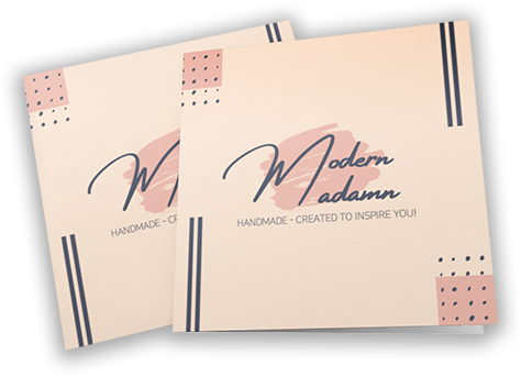
A small ecommerce company that sells lovely and beautiful earrings that really match outfits. Lyka (the owner) wanted to redesign her old logo to be simple yet still look modern with pastel colors in the background color theme.
Was to look for a wordmark that would really match with the business while still looking fancy even when it was printed on the packaging since the client wanted to use this logo on her packaging.
The Solution
ASWG Designs, proposed various wordmark logotype variations that the client could choose from which used a pastel color for the background.
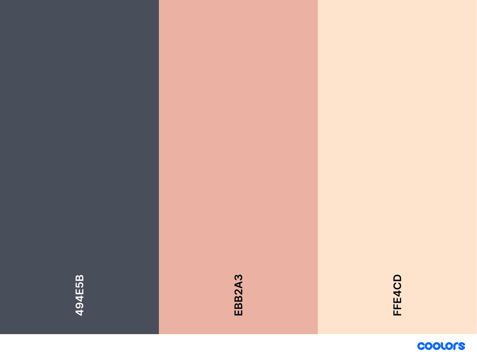
Colors
The clients wanted pastel colors, so ASWG Designs used the color combination of dark grey and peach. Dark grey was used for the text while peach was for the background and that really gave a pastel look for the logo.
Typography
The “Amsterdam” family was used as the wordmark for the logo while “Roboto” regular was used for the subtitle under the wordmark.
HEADLINE & Body
Amsterdam Four
A B C D E F G H I
abcdefghijklmn opqrstuvwxyz
1234567890
WIREFRAME
RESULTS and ACHIEVEMENTS
The client really loved the variations that were presented which she had a hard time choosing the best logo to use. The client love the collaborative nature of the logo creation process and she was able to decide upon the logo she loved, and she was extremely excited using it for her business.
")


")